
Average Purchase Value (APV) Analytics
Overview
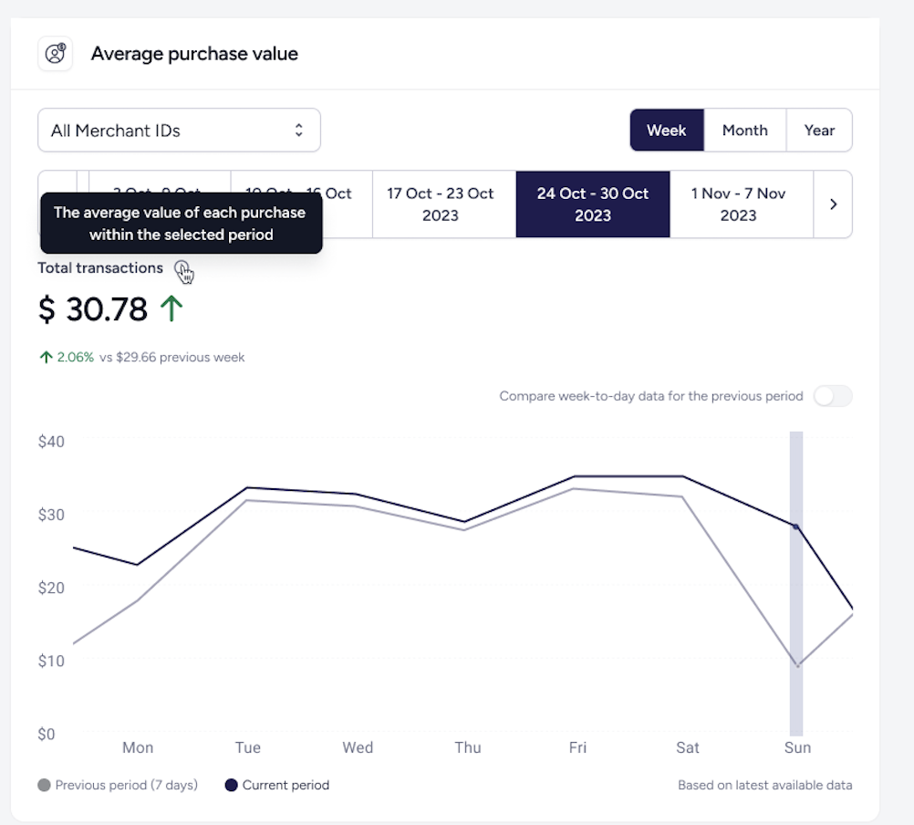
The Average Purchase Value (APV) Graph provides an visual representation of your customers' spending habits, allowing you to track how much the average customer spends per transaction over time. This graph helps you to identify trends in customer behaviour, evaluate the effectiveness of pricing strategies, and compare performance across different time periods or locations.
Navigate to the Insights and Analytics page from the vertical navigation menu on the left in your Presto Dashboard, then scroll down to view the APV graph. By default, it will display data for All Merchant IDs for Today. Use the control bar at the top of the dashboard to adjust the date range, granularity, and compare against previous periods to gain deeper insights into your business performance.
Key performance visuals
At the top of your APV graph, you will find calculated summaries for your selected time period. These metrics provide a snapshot of your business performance:
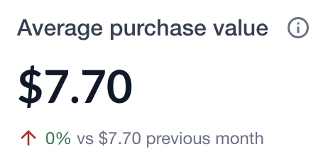
These metrics display your Average Purchase Value in $ for the currently selected time period.
- Calculation: This is calculated by taking your total gross sales and dividing it by the total number of successful transactions (Total Sales divided by Total # Transactions).
The Line Graph

The trend line provides a chronological view of your APV.
-
The Y-Axis (Vertical): Represents the dollar amount ($).
-
The X-Axis (Horizontal): Represents time (Days, Weeks, or Months).
-
Hover: Move your cursor over any point on the line to see the exact average value for that specific date or period.
You can manipulate the data displayed using the control bar located at the top of the dashboard:
- Day View: Best for monitoring daily spikes and shift performance.
- Week View: Ideal for spotting mid-week versus weekend patterns.
- Month View: Perfect for high-level monthly growth and seasonal reporting.
- Merchant Facility: If you manage multiple locations, use the drop-down to isolate the APV for a single site or view an enterprise-wide average.
Comparative Benchmarking
To determine if your current performance is a success, use the Compare Against Previous Period feature.
When activated, the graph overlays a secondary, lighter trend line representing the same timeframe from the previous period (e.g., this month vs. last month).
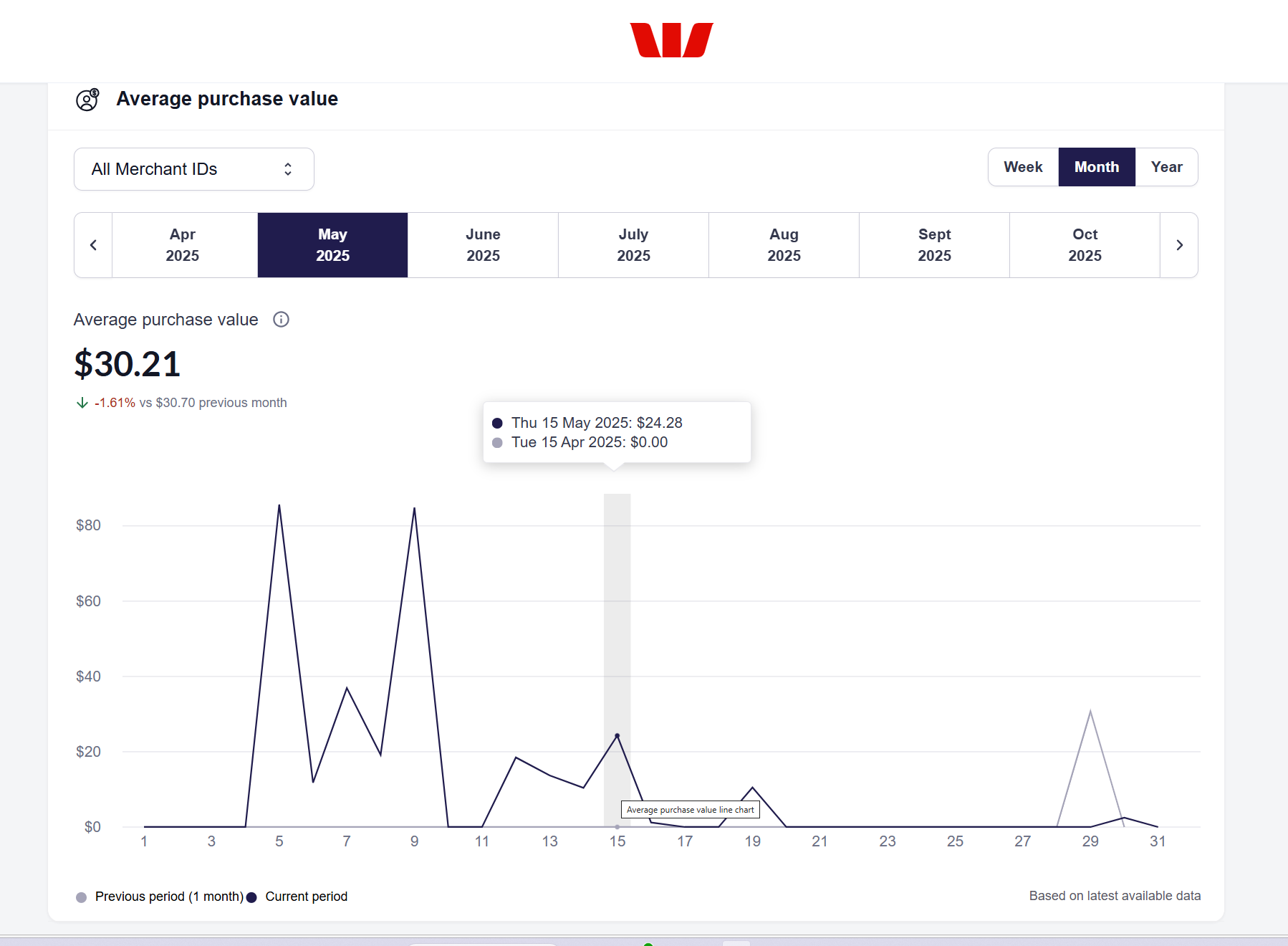
This helps you instantly identify if your current average ticket size is growing or shrinking compared to historical performance. If you've recently raised prices or introduced "bundle" deals, this comparison will validate if those strategies are working.
If you see your Average Purchase Value increasing while your Total Transactions remain steady, it indicates your customers are spending more per visit—a strong sign of successful upselling or improved product mix.
Updated about 5 hours ago